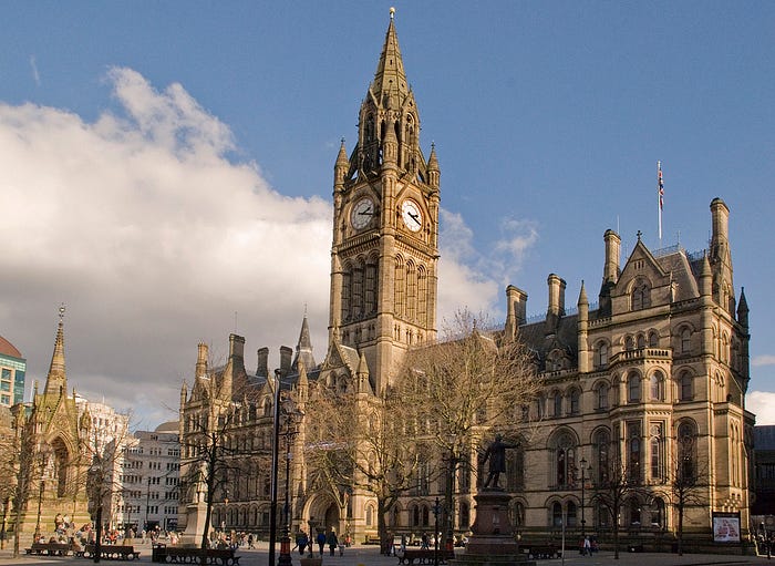
A Totally Objective Ranking of Every UK Local Authority Logo
The humble local council. Recipient for every half-informed beef of the British busybody, from potholes to bin collections to tree-felling. But they do some more noble tasks, too — providing housing, social care and public services like libraries for millions of people.
These quite disparate functions need a banner under which they can operate, but the brand identity of local councils often isn’t their top priority. Among much chaff, though, there are a few stars (and some really astonishing disappointments).
Each has been ranked using some broad criteria accounting for the adherence to design principles, the originality of the concept, and the technical execution, with nebulous bonus points added or subtracted on a whim, because unlike your local council, this is not a democracy.
Also, I’m not doing Parish/Community Councils because 1) a lot of them don’t have logos, 2) they have a budget of five pence and a bit of string so it wouldn’t be fair, and 3) it would take even longer than this already has.
N.B. If you’re a council or anyone else in need of design or digital comms work, I am a freelancer and available for hire! My portfolio is at robinwilde.me.
Let’s start from the bottom.
403. Allerdale
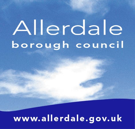
Wedged into Northwest Cumbria, this is the council containing Workington, Cockermouth and Keswick, and so is somewhat central to the Labour Party’s ongoing psychodrama.
It’s a good introduction to one of the first principles of these rankings, which is that it shouldn’t look like a Windows 95 default desktop background. The odd blue blob in the bottom is clearly meant to be a nice artsy curve, possibly representing the Cumbrian coastline, but it half arses it so badly I think it might actually have been made in Paint.
The only thing I like here is the font choice for the URL, which is basically okay, but clashes so horribly with the main text it still damages the overall experience.
402. Bury
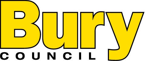
My, but the Red Wall is making itself felt early on. Bury sits north of Manchester and is notable for having one of the UK’s largest Jewish population clusters outside of London. Unfortunately, it’s also got a logo like a dodgy construction company you’d see on ITV2. Bury Council: pay cash in hand for a skip they never bother to collect.
401. Fareham

One rule of council logos is that you’d better have a bloody good reason for including a crest, and doubly so if it looks like it’s been drawn in felt tip pen and then scanned in.
Fareham, leaping from the urban north to the South Coast, fails on that measure, as well as choosing a boring system font. There’s an attempt at flair with the stacked “borough council” but none of the elements work together and the whole manages to be offensive to the eye and boring to boot.
400. Bromsgrove

This bastion of West Midlands Conservative territory fails on the same grounds as Fareham (even using very similar fonts) and rises one rank higher by virtue of the quaintly ghostlike green glow around the crest. The reanimated helmet and vaguely communist shield might make for a mediocre Dark Souls boss.
399. East Northamptonshire
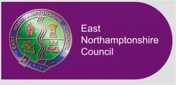
Frustratingly, after serial financial difficulties for local government in the county, East Northants county was abolished between me compiling these rankings and getting round to writing them up. But I’ve done the work, and it’s probably still on some wheelie bins, so fuck it.
This falls prey to the crest plus boring font trap, but with the addition of the hideous sheen effect over the crest, which itself looks like the logo of an upmarket S&M club.
398. South Lakeland
The cardinal sin of being badly conceived, uninspired, and poorly executed, SLDC manages to make a beautiful part of the country look hideous. It’s known for being pretty much the most Lib Dem place in Britain, one of just two local authorities to vote for the party in the 2014 European elections (and the other one was Gibraltar).
The colours clash, the font doesn’t work in all caps, and you can’t use it in monocolour. Bad.
397. Carmarthenshire
Our first non-English council! Generally these rank highly, because local government reorganisation in the 1990s means they generally have newer logos. However, this fails the test.
Welsh councils have the challenge of incorporating bilingual names, but this manages to somehow feel like too much text even accounting for that. The wyvern isn’t a terrible device but it’s somehow acquired neck rolls, and the frustrating primary coloured scheme is not a pleasure for my eye.
396. Babergh
I know it’s a cliché that East Anglia is backwards, so I’d like to congratulate them on obtaining a copy of Deluxe Paint for their Amiga 500. This is confusing as it has clearly been produced digitally, but by someone with absolutely no artistic sense. The lurid colours, massively busy contents and low-resolution system fonts might work for an adventure game from 1991 but not for an organisation in control of services for 92,000 people.
395. East Cambridgeshire

East Cambs have at least tried to match some colours, but their very odd crest does nothing for the overall package. The tiny horse in particular looks like something from a surreal meme, and while Ely’s cathedral is very nice, why not represent it through a more direct means than Foal Wave and the Electric Cardinals (my new shoegaze band).
394. Tendring

Were you even trying?
393. Epsom and Ewell

Epsom and Ewell is a place so NIMBY it’s been run by a residents’ association party since 1937, and where even the most ardent left-wingers vote for the Conservative Party. As such it’s not surprising that the logo appears to be from 1986 and feature two horses who’ve spotted that you’ve just submitted a planning application for new affordable homes. Unfortunately, the weird mix of italicisation angles and the unattractive garden centre green places this low on the list.
392. Lichfield
I’ve heard the combination of turn-of-the-millennium handwriting fonts and politically neutral colours termed ‘Blaircore’ (imagine a brushed steel new leisure centre in 1999 stamping on a human face, forever), which is ironic considering this was one of the third of seats which resisted the charms of New Labour, electing Michael Fabricant by a majority of 238 in 1997.
In any case it’s a particularly gratuitous handwriting font even by the generally crap standards of the genre, looking as though it was scratched out by a ten year old with a pen near the end of its ink supply. The supporting font (which looks like a knock-off Futura) does nothing to complement it.
391. Bridgend
The good people of Bridgend are to be congratulated on their good sense in electing Sarah Murphy as their MS, but not for their choice of council logo.
They’ve dealt with the bilingual issue fine, then mucked it up with a main device that looks like two plastic bags learning to pole dance.
390. Bassetlaw
A very bad example of trying to do far too much in not enough space. I think I can count eight different elements in here. Simplify, man!
389. Mid Suffolk
It’s better than Babergh, but not much better. As far as I’m aware, Suffolk is not a pentagon, and Mid Suffolk is bordered by six other councils, not five, so the mix of devices here doesn’t really bring much across to me. Mind you, if my largest town was Stowmarket I wouldn’t have much to shout about either.
388. Three Rivers

I know it can’t be the most enthusing career choice to work at Three Rivers Council but really, lads? It’s an uninspired concept deployed badly.
387. Bath and North East Somerset
If you’re going to create your logo at 4:55pm on a Friday, at least do it with some dignity, and not a colour scheme devised by glancing at a nearby globe. This council area contains both a beautiful spa town and mining heritage, and you really couldn’t think of anything?
386. Hinckley and Bosworth

This dull chunk of West Leicestershire had their crown thoroughly stolen by the neighbouring city once Richard III rocked up outside their jurisdiction, but luckily I lived there until I was two, so when I’m world famous they can claim me if they like.
This is a typical crest and low effort text attempt, which wins some points for containing the crest in a box and choosing a nice font with a strong ampersand game.
385. Wychavon

If you must be bad, at least be entertainingly bad like the ones drawn in felt tip. This is just low-effort dreariness.
384. Hyndburn

When you cross the boundary from Sheffield to Rotherham, the signs do not welcome you, but flatly proclaim “You are in Rotherham”. I like the honesty of a sign that tells the truth about the emotions associated with a place, and on that measure Hyndburn does not pass the test. I can imagine circumstances in which waking up in Accrington might be a blessed relief, but only if you’d previously had a bag put over your head and been knocked out with a cosh.
I would also advise them on the necessity of punctuation. Hyndburn might be “the place to be an excellent council” but it’s suspiciously circumspect about the council they’ve already got.
Also, mega-complicated crest plus modern fonts = no.
383. Nuneaton and Bedworth
United to achieve what? Surely not inspired graphic design.
382. Medway
More Blaircore, but mostly because this reminds me very directly of the kind of logo you’d see on a leisure centre, and because North Kent was a place Tonty Blair was very much behind. Based on the river, there’s a nice concept here, let down by the outdated serif font.
From a technical perspective, they gain points for providing their logo in a vector .svg format for scaleable use. If you’re ever trying to forge a council tax exemption letter and you live in Strood, bear it in mind.
381. Runnymede

When he was an MP, Runnymede was Philip Hammond’s neck of the woods, and Spreadsheet Phil probably thought this was a bit too exciting for his taste. The big R shows some promise, but the pedestrian font choices and wedged in crest let it down.
380. Rushcliffe
We have our first bonus points for a visual pun, as the R appears to be rushing — geddit? Unfortunately the ornate R is let down by the boring rest of the logo. Next.
379. South Norfolk
Like Babergh if someone with a modicum of design nous had a crack at it with a copy of Microsoft Word. Not much nous, though. Too many colours and a lack of commitment to the variable width curves.
Also: South Norfolk borders Mid Suffolk. What happened to North Suffolk?
378. Test Valley

For a place that sounds like a debug area from a video game, this is not a terrible conception — you’ve got a river, you’ve got fish, go for it. Single colour is also a good idea.
However, the attempt at perspective on the river doesn’t work — it looks like a sequel. Test Valley 2: Test Harder.
377. Havant

Two Vikings from a Flash game do battle by a slightly squashed road sign. It’s innovative, I’ll give it that. I’ll let the hideous gradients on the badly recreated crest speak for themselves. Just use the Image Trace tool, I beg.
376. Harrogate
For a quite attractive place, this logo is pedestrian in every way. Not awful, just like eating a bread sandwich.
375. Tunbridge Wells
The device reminds me of the sort of low-selling young adult fiction I used to take out of the school library in about 2006. An attempt has been made here, but it feels like a half-developed concept that gave up on itself halfway through the execution.
374. Folkestone and Hythe

Unfortunately, given it’s copied directly from the famous white horse, this horse does look more like it’s in pain than galloping majestically. It might be the lack of eyes.
373. Copeland

Did we mention we used to have a nuclear power station? If I wanted to emphasise a commitment to clean energy I wouldn’t have picked a brand colour best described as “baby diarrhoea”. The main word mark isn’t bad, but the handwriting font throws it off course towards Blaircore. Incidentally, probably not a coincidence that the last time these authorities had the money for a rebrand was under New Labour.
372. East Devon
I’m not against the idea of this flaglike logo— the colours clearly represent sea, beach, something red (farmland?) scenery and sky. They’ve just chosen an unsubtle mess of colours to represent it, and the text bumping up against the edges makes the whole thing feel claustrophobic.
371. Elmbridge
I had no concept of where this was until I googled it and found out it’s Esher, in Surrey, so home to Dominic Raab. They’ve tried a few things here, the wibble and the crest both being clichés so they lose points. They’ve also made the pun too obvious and the ellipses really make the thing groan. Just have a logo of a bridge.
370. Enfield

Our first London Borough, and the weakest of what are generally a strong batch. The weirdly wide kerning on the font let it down, and I had to Google to discover the creature is called an Enfield. according to Wikipedia, “the enfield has the head of a fox, the forelegs of an eagle, the chest of a hound but the rest of the body like a lion and the hindlegs and tail of a wolf”. Unfortunately this is lost here, where it looks like an angry spaniel.
369. Fenland
Not a bad concept — “things grow here, and it’s in the East so the sun comes up here” works. The font choice is okay too, though I’m not sure why there’s Futura for the supporting text and something else (Paralucent, maybe?) for the main word mark.
Unfortunately, the yellow on purple and the shape of the main device makes it look like a logo for a tennis club.
368. Lincoln

Lincoln’s logo nearly works — a less loopy serif for the city name and ditch the boring shield crest and you’d probably have something crisp and decent. The low quality and those flaws relegates it to low-mid table, however.
367. Mid Devon
Aw, you tried. There’s the basis of something nice here in the square composition, the chunky fonts and the castle device, but it’s just a bit too cheap and system font-looking to be good.
366. Mid Sussex
Another near miss. If you had this as a single colour cut out with a nice font, you’d have something pretty solid. As it is, the gradients and the stroke around the silhouettes cheapen the whole package.
365. Newcastle upon Tyne

I get strong “designed by a local school child in a competition” vibes from this one, which is a clever move on behalf of Newcastle council as it prevents me being despicably harsh to it. That having been said, surely one school child in a city of 268,000 could have come up with something better. The castle is nice — almost isometric — and could have been the basis for something very cool.
364. Reigate and Banstead
Estate agents. And it’s Surrey, so expensive estate agents are perhaps appropriate, but not an inspiring municipal logo.
363. Rushmoor

This is the sort of logo a proper graphic designer would create, but if they were given a budget of £10 and about 15 minutes to come up with something. It’s fine. The long leg on the R adds a certain sexy allure to *checks notes* Aldershot, but it’s not going to light anyone’s world on fire.
362. Slough

Slough has the fundamental problem that it has become a punchline, despite being a perfectly respectable commuter town housing much of Britain’s technology industry. That means coming up with anything that tries to make it look pleasant or exciting will be scoffed at, so they’ve come up with this incredibly safe logo that can appear on a council tax bill without you ever noticing it’s there.
361. South Hams

A pleasant attempt at the hand drawn style (I particularly like the extruding right hand seagull) let down by a sub-par font choice that for some reason mixes serif and sans-serif. The sort of logo I’d have seen on a children’s publishing imprint in primary school.
360. South Ribble
The new South Ribble logo was introduced in November last year and apparently has been embroiled in a “too modern” row, which tells you all you need to know about Northerners. It’s a nice attempt at reworking the crest and text cliché into something serviceable, but suffers from too many colours and the shoehorned Lancashire rose. However, it’s a damn sight better than the old one, so press ahead, I reckon.
359. Wellingborough
Another one abolished in the Northants reorganisation, Wellingborough Council’s crushing, wibble-using mediocrity knows no bounds. An honourable mention, though, to Wellingborough Town Council, which is actually quite nice.

358. Blaenau Gwent

The name Blaenau Gwent itself being Welsh helps a lot with the bilingual problem here, and the hill and dragon concept is nice. it’s a shame they went ham with the Photoshop Drop Shadow function and just copy-pasted the hill three times, though.
357. Hammersmith and Fulham

The infamous wibble returns, but this time with at least an element of style via the 3D ribbon effect. Shame about the blue and green colour scheme, which doesn’t work at all but seems to remain endlessly popular with councils.
356. Telford and Wrekin
TWTWTWTWTWTWTW — sorry, this has hacked my brain and replaced my previous question of why they’ve used a giant snowflake.
355. Vale of White Horse

Imagine being given such a great bit of visual imagery to work with and producing something so thoroughly mediocre. I’m not angry, just disappointed.
354. Westminster

Because it has Parliament and some very posh bits, it feels it has to be serious and weighty. Still, it’s about as good as the crest and text logos get, which is to say, thoroughly middling.
353. Basildon

A thoroughly obvious 5/10.
352. Blackburn with Darwen

This is an awkward council name to begin with, so why draw attention to it with that handwritten “with”? Blue and green, again, but at least in dark enough shades they don’t clash too horribly. Meh.
351. Redcar And Cleveland

A strong concept (using the coastline on which the council area sits as the basis for the R, non-geography knowers) let down by dull fonts and colours — not an unusual failure on this list.
350. Falkirk

When I finally build my clockwork time machine I’m going to go back to the 1800s and intimidate whoever came up with using medieval heraldry for municipal identity work until they stop. Another one for the landfill.
349. Braintree
They’ve noticed the crest and text style is crap, they’ve tried to do something with it, points for effort. It doesn’t really work, and the font is ugly and weirdly spaced, but at least they had a go.
348. Breckland

Our first “deer in motion” council logo of the run, and won’t be the last. Comes bottom of the heap thanks to the dodgy rendering and the fact it looks like it’s squatting.
347. Chorley
I once applied to work for Chorley council and they never returned my application email, so marks off for that. I joke, but this is still very unremarkable but for the molten lava bubble in the middle.
346. Lewes

Probably for the best they didn’t include their penchant for burning effigies of the powerful every Bonfire Night in this logo, but another coast and hills tapering stroke is rather tired. At least the font is a solid slab serif.
345. Hartlepool

Our next deer, this time being ridden by a Dachshund. Given the town’s penchant for mistreating animals (and Labour candidates) it seems like a brave move to have these badly rendered beasts adorning, yep, another blue and green background. Font’s nice, though.
344. Hastings
Purple is another popular colour for council branding that doesn’t look overly political, and they’ve tried a bit with this one. They’ve got the mystery obelisk. They’ve got the toy boat. All the great attractions of Hastings in one convenient, weirdly coloured package.
343. Rutland
Rutland is the British Bielefeld. I’ve been there and I couldn’t tell you whether or not it exists. There’s certainly no justification for it being an independent county when it has about as big a population as my council ward. Nevertheless, it has a logo, and it’s an okay one as they go. Well balanced fonts and a nicely simplified two-colour crest.
342. Waltham Forest
It’s just a tree again, albeit a quite well-drawn one.
341. Sefton

Sefton Central is the Labour constituency with the highest home ownership rate in the country — that’s the Merseyside Effect for you. Anyway, this is a logo with some nice elements that don’t at all try to marry together. A promising start with a disappointing execution.
340. Selby
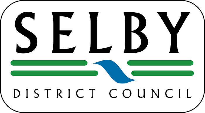
Using the river device as a breakwater between the two lines of quite nice text was an inspired idea, let down by the MS Paint-grade execution of the line work.
339. South Holland
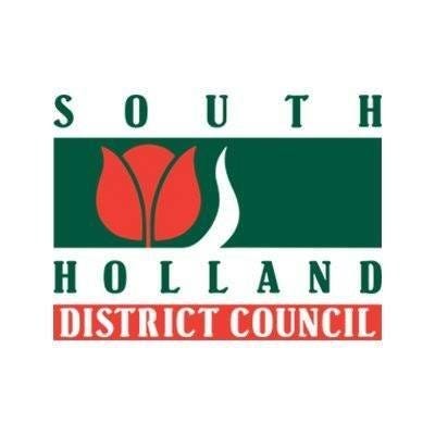
Yeah, a flat expanse with a stream and a flower pretty much meets my memories of being driven to Norfolk. Not a bad concept or execution, but too much going on.
338. Staffordshire Moorlands

Competent font work makes up for an uninspiring crest design.
337. Stoke on Trent
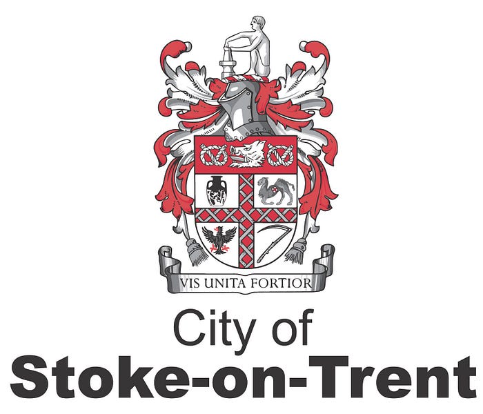
Sans serif with a crest is a rare choice, but Stoke gets points for boldness and it pays off — the crest’s white, grey and red colour scheme works nicely and it’s been well digitised. Not sure why it contains a dying camel.
336. Teignbridge

Another wibble, but done artfully and incorporating the sea/land/beach aesthetic in an inoffensive way. Won’t light the world on fire.
335. Tewkesbury

Doesn’t do anything particularly special but a nice use of negative space. Would have liked to see a higher quality version available and the castle shape used in a more inspired way.
334. Uttlesford
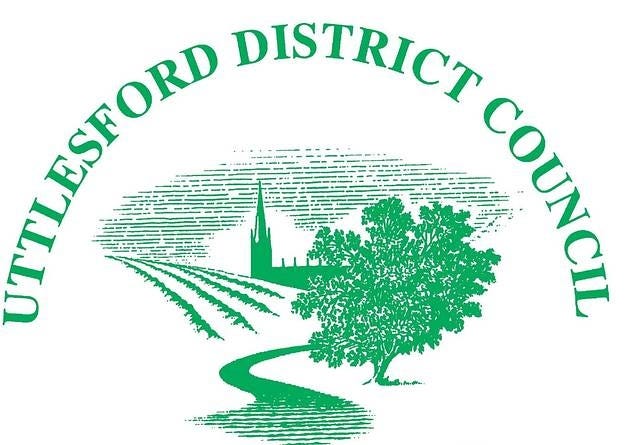
I wouldn’t pick it for technical quality, but if you’re going to have something hand drawn, this is a decent enough effort. The problem is you couldn’t use it effectively for much — it wouldn’t transfer well onto a t-shirt, a bin or a lorry.
333. Argyll and Bute
Nice font choice, good use of the descenders to fill the space, nice celtic cross. Would be in the upper reaches of the list if not for that hideous blue-green gradient.
332. Highland

It’s the UK’s largest council area! A strong idea with the polygons, let down by the weak font choice and Wimbledon colour scheme. You could say it really gets on my Wick.
331. Moray

I wonder if they got the same designer in as the Highland Council? This uses the polygons even better, marred by being a bit busy with the multitude of colours and the faux-Gaelic text.
330. West Dunbartonshire
“Nice council logo, Bob!”
“Thanks Anna”
“It doesn’t say ‘council’ anywhere, Bob”
“Shit — stick something in quickly.”
329. Torfaen

That’s a nice little bridge mark there, let down by the tacked-on text layout.
328. North Hertfordshire

A pleasant enough wordmark that does come across as though the letters got left out in the sun. Could be the logo of a liberal arts college in New England.
327. Doncaster

Another one for landfill, earning a bonus point only for the nice vector straightening of the motto ribbon. They’d have been better off losing the crest entirely and putting the text over it.
326. South Gloucestershire

A pleasant enough vector artwork and some okay fonts let down once again by the interminable Wimbledon colours.
325. Wakefield
Raw, unadulterated, finest black-tar Blaircore, down to the inoffensive blue and green that remind me of Newsround in about 2003.
324. Spelthorne

What if a tree device, but we just kept EXTENDING IT F̸̫̍O̶̧̱͐R̶͖̖̎È̵͚͐V̴͕̾̃E̸̻̾Ṙ̶͇͈
323. Derbyshire Dales

Low-effort and not what it could have been. The social media version where all the text lies within the folds of the hills, which are enclosed in a circle, is stronger.
322. Ashford
Ash-bored more like.
321. Amber Valley
You get the impression they originally wanted to use the valley shape as the V in the initials, but chickened out as they didn’t think people would get it. A shame as it had potential otherwise.
320. Bolsover

The sort of logo the intern comes up with when you need a council logo for a TV set at five minutes’ notice.
39. Daventry

Another one direct from the BBC sets department, a shame as Futura is to be applauded whenever it appears. Overdoes it on the hills, and some margin between the text and the edge, please — we’re not barbarians.
318. Warrington

Much like Warrington itself, this is a total blank consisting of landfill between two much more remarkable places.
317. Erewash

NEXT!
316. West Lancashire

Get in the landfill with the rest.
315. Harlow

One more for the landfill.
314. Boston

The good thing about Boston being by the sea is it doesn’t have to go to landfill, it can be dumped overboard instead.
313. Wokingham

That lion is going to whack you with an oar. Or start a fire with a match. I can’t quite tell. Either way — into the landfill.
312. Bradford

Well, at least it’s near the top of the landfill.
311. St Helens

GIMME AN L.
GIMME AN A.
GIMME AN N.
310. Bracknell Forest

Another day, another deer logo for a council. I suppose it’s not politically contentious to like deer. Unless you’re playing to the lion constituency. Anyway, good linework and an inoffensive choice of fonts and colours make this solidly okay.
309. Broxtowe

This wouldn’t rank highly for being a mediocre crest n’ texter, but I liked the way the badger looks like he’s trying and failing to pass by unnoticed, like a bloke with a toolbox arriving to fix a leaking toilet during a wedding.
308. Burnley

Solid work adapting the crest here, which works well as a low-detail vector. Shame about the random teal top level domain info rammed on the end, which I’d excuse as not really part of the logo but I can’t find a version without it.
307. Cotswold

I secretly love the little cartoon fish, and this is nice monoline work. A shame about the slightly anaemic motto.
306. East Sussex

This is almost really nice, but I can’t think of any rational explanation for why the sea is broken up like that. A really passive aggressive way of saying “we are NOT West Sussex”?
305. Gloucester
Inoffensive. Next!
304. Havering

For a place as rabidly right wing as Havering, there’s at least some progressive instincts on show in their choice of typeface. Shame it doesn’t really work with the man wearing a castle as a hat.
303. High Peak

I can’t believe it took this long to get one with Comic Sans! It’s saved from being down with Babergh and co. because I actually rather like the crest.
302. Castle Point

Castle What’s-the-Point (of this logo) more like.
301. Kettering
Kettering was where the first Co-operative Party MP was elected, in the 1918 General Election. It’s continued its reputation for solid dependability with this unremarkable but serviceable wordmark, until the council was abolished earlier this year.
300. Merton

Notes of Blaircore with the vector wheel and wibble, but clearly switched allegiances post-2007 by colouring it a mysterious shade of dark brown.
299. Milton Keynes
This logo is crying out for a fun exclamation mark that just isn’t there, and lacks the confidence in itself to not bother with a staid full length naming in lower case. Believe in yourself, Milton Keynes!
298. North Devon
I get the impression they wanted to do either beach or fields with the third colour, couldn’t decide, and settled on splitting the difference for a result of low-grade mushy peas.
297. Oadby and Wigston
This borough just south of Leicester features a sheep and a tiger who are friends with an owl. I hope they all have a nice time in whatever children’s book they’re on loan from.
296. Luton

Thicken the line to the width of the L and you’d have something decent here, but as it is, it’s notable only for its simplicity.
295. Dundee
There’s a decent concept here that suffers from having had lots of extra crap hung on it over the years like a Bucking Bronco. Not representing jam, jute, journalism or the famous Tay Bridge all feel like a missed chance.
294. Redditch
It’s a bit busy and eighties, like they’ve just got hold of a Commodore 64 and their first bit of graphics software, but it’s not bad for it.
293. Buckinghamshire
It’s generally a bad idea to use an “est” on your logo because if you’re designing a new logo, chances are you aren’t very old. It’s even more lame when the council was pieced together just a year ago. Lose that, and it goes from slightly bad to basically okay.
292. Richmond upon Thames

Quite a pleasant start with the river nod in the main mark, utterly sabotaged by the shouting caps delivered in a font that looks as though it would snap if you looked at it funny.
291. Richmond, Yorkshire
Coincidence that these two are back to back. Nevertheless, nice concept let down by poor artistic skill. Long live the mosquito bird of the North Yorkshire Moors.
290. Rossendale

Another designer trying to avoid my opprobrium by giving me absolutely nothing to work with.
289. Cambridgeshire

If you’re going to use brown as your key colour, you’d better have a damn good reason for doing so, and I’m afraid Cambs Council just doesn’t.
288. Tonbridge And Malling
This very definitely wasn’t created by a professional designer which tends to allow me to grade more on a curve, and it reminds me most of the logo for the old 3DO games console from the 1990s. I think there’s a charming level of effort to it, but it doesn’t really communicate much except for “we have a castle or possibly some lego bricks). Also, the curves on the central river device are slightly asymmetrical and it’s really bothering me.
287. Isles Of Scilly

The illustration (which is at least rather nice) was clearly commissioned separately before someone on the council (which in fairness has just 2,000 residents) realised it needed to say the actual name of the place, panicked and used a system font. A letdown!
286. Sandwell

Blaircore meets pixel art meets an album cover design from about 2002.
285. Belfast
Belfast’s logo should be better than it is — clearly they saw the need for a new one, but then seemingly gave up after adding some drab grey text onto the old one. Disappointing.
284. Shropshire

Can’t say anything bad about this one. If I do, the tigers will eat me.
283. Winchester

In my mind the H is extending a flirty little “come hither” motion to the City Council, which tickles me enough to bump this up from the crest landfill.
282. Somerset West and Taunton

They certainly are Taunton me with this flat, unchallenging logo.
281. Stevenage

In my notes, this is the only one written in all caps, which may be a trauma response to my only visit to Stevenage in 2018, when I booked a hotel for the wrong month, and had to trudge around the 50s-vintage town centre at 11pm in order to find the last available room, in a hotel otherwise entirely booked out for a wedding.
The logo really sums up the Stevenage experience, appearing like a mark on a school register. Stevenage: it certainly is present.
280. Stockton-on-Tees
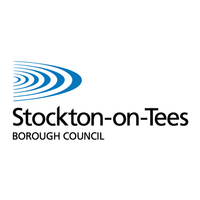
Did we mention we’re near a body of water?
279. North Yorkshire
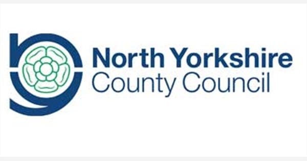
The stalk of the N is too small for such a flat deployment, leading to it looking like a B. The effort to encircle the Yorkist rose is appreciated, but largely wasted.
278. Wealden
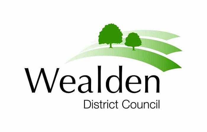
Wealden appears to be a 2.5d platformer like something you’d get on the PlayStation in 1995. The gradients let this one down.
277. West Berkshire

I’d praise them for the innovative font work here in combining the E and the K, but I’m at least 30% confident this was a mistake. Absent that, it’s a bog standard crest n’ text.
276. Clackmannanshire

Logos aside, this is my favourite local authority name to say. In accordance with that, I appreciate the hands on the crest, which appear to be going clackclackclackclackclack. What’s that? 300 more of these to go. I see.
275. Tameside
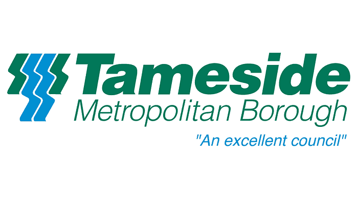
A very eighties holdover if ever I saw one. Now that I’ve noticed the italicisation on Tameside and Metropolitan Borough are at slightly different angles, I can’t stop seeing it, so you have to too.
274. South Lanarkshire

I appreciate the background shapes forming a subtle S, even if the font and multicoloured design is running a little 1990s.
273. South Ayrshire
A brief attempt at boldness on Ayrshire is stifled by the timidity of “South” and “Council”, and the system font Gaelic translation does nothing to assist.
Bit weird of them to have that, actually — South Ayrshire has just 417 Gaelic speakers, virtually all of whom will know it as a second language, and is ranked 24/32 for number of speakers. Even Argyll and Bute, which comes in at third with 4.5% of the population, doesn’t have a Gaelic translation on its logo! So congratulations to South Ayrshire for being very inclusive.
272. Flintshire

I get that they wanted the burgundy squiggle to help turn it into an “F” but I can’t quite figure out what it’s meant to be. I wondered if it might be a very abstract depiction of a Welsh dragon breathing fire, but it doesn’t really work with the turrets on the F. A castle that’s also a dragon isn’t a council logo, it’s a Sabaton album cover.
271. Peterborough

Well it’s a squiggle, and a not especially stylish squiggle at that, but if we take the (admittedly a bit generous) interpretation that it represents the Nene winding through the city, it does at least mean something. And the selection of greens is nice — shame about the out of place serif system font.
270. Blaby
Blaircore-light here, as the font choice isn’t bad and the colours are more muted than in Blaircore Classic, but the tortured visual pun that needs to be explained in text underneath is the core of it.
Also, Blaby is emphatically not the heart of Leicestershire. It’s a semi-rural district that borders Warwickshire and contains the two motorways — the M1 and M69 — that people use to exit the county. Leicester, which has the benefit of also being right in the middle, is the heart of Leicestershire, but all the Tory councils surrounding it seem sort of ashamed of the place. Dunno why, the Curve Theatre is great.
269. Rother

Everyone enjoys a bit of pointillism, and the tree-castle visual isn’t a bad one. Shame about the anemic colours and fonts.
268. Broadland
I wouldn’t say this had a whole lot of design skill put into it, and the superfluous motto takes away some of the shine, but the font choice is nice and the boat is pleasantly understated as an illustration. It’s a good thing to because it’s about the only thing to recommend the weird liminal space between Norwich and the more seasidey North Norfolk.
267. Charnwood

Charnwood’s chubby fox doesn’t do much to bring across what the council area is about — I’d have gone for Loughborough’s Carillion Tower, maybe — but it’s got a certain charm. Once again, it’s brought low by the addition of a pointless and ugly blue-green gradient on the squiggle.
266. Calderdale

Is there anything new under the sun? Not in West Yorkshire, there isn’t.
265. Cherwell

For some reason this council is not called Banbury, when that settlement makes up the bulk of its population. I suspect rural Tory councillors were involved. Anyway, it has a logo like a toothpaste brand. Not a good one — one of the Aldi knock-offs that skirt as close as possible to the line of copyright infringement — but one that gets your teeth clean and that’s fine on a budget.
264. Welwyn Hatfield

This one feels like they got most of the way there with a redesign, then phoned it in at 4:55 on a Friday afternoon. The fonts and colours are nice, the crest reworking has been very lazily done — I think those trees were just copied and mirrored.
263. Corby

Another one abolished in the Great Northamptonshire Massacre, this one has tried to incorporate the big C into the squiggle, so there’s real effort there. Unfortunately the heavy serif-ness of it makes it almost pre-Blaircore in its 1990s heritage. Majorcore?
262. Rochford
Absolutely nothing noteworthy to say about Rochford’s logo so I guess I’ll leaf it here.
261. County Durham
Paring the crest back to a limited colour scheme, outlining it and putting it on a background is about as good as you can do without modifying the core artwork, so this is an okay effort that nevertheless fails to stand out.
260. Croydon
It is important to remember that for this work, someone was paid money. As someone who aspires to get paid for the bare minimum of effort, I can only live in awe of them.
259. Dudley
A straight down the line example of Blaircore. The neutral Newsround blue and green combo, the plain but modern-leaning font, the aspirational millennium squiggle. This is the Chicken Tikka Masala of Blaircore council logos.
258. Wiltshire

I was going to type a short review of this but I fell asleep trying.
257. East Riding of Yorkshire

For those who haven’t spent a tedious eight years absorbing this stuff by osmosis, Yorkshire was once split into three subdivisions known as “ridings” — East, North and West. The West Riding split once its population grew to hugely outstrip East and North Yorkshire because it contained Sheffield, Leeds, Bradford and all the other heavily populated areas, becoming West Yorkshire and South Yorkshire. The North Riding is now North Yorkshire both officially and colloquially, leaving the East Riding as a weird holdout.
It does not include Hull, which is its own unitary authority, meaning that it has zero Labour councillors — but did until fairly recently have SDP representatives from Bridlington.
None of this relates to the logo, which is pretty straight down the line as far as using the Yorkshire rose, the neutral green and a conservative serif font — although it highlights that they should really change the name, as this layout implies it is part of a larger “Yorkshire Council” which does not exist, despite Dan Jarvis’s best efforts.
256. East Staffordshire

Coming into this, I was going to comment on how a place that contains Alton Towers should be able to generate a more exciting logo than this, but then I checked Google Maps and the theme park is just over the border in Staffordshire Moorlands. Visitors to East Staffordshire can instead content themselves with the delights of Tutbury Castle and HM Prison Dovegate.
Anyway, this is boring and amateurishly drawn. You have trees and a bridge, you say? So does everywhere else. Try harder.
255. Eastleigh

Until I Google Mapped it for research purposes I’d been labouring under the impression that Eastleigh was by the sea, so I was surprised to discover (and local residents, rev your green ink) that it’s basically an outlying suburb of Southampton and several miles inland. All of which means I don’t know what the weird hole punch dot on the logo is. Maybe they make hole punches there? It’s an okay enough logo. Reminds me of the Colorado license plate.
254. Gloucestershire
Dull crest, dull font, livened up by the speed lines they’ve tried to draw under the name. Makes the council go faster.
253. Gravesham

Drink every time you see a boat, a deer, or a fox. On second thoughts, please don’t, I need you alive.
Another nice font choice let down by the shoehorning of handwriting font and the clip-art boat.
252. Epping Forest

Points for resisting the urge to go for a tree here — the EF device is strong, and should have been matched with the fonts. Also, I’ve noticed this a few times — a superfluous line will seldom improve your design.
251. Hart

This deer looks like he’s fucking furious about something and is about to deploy Horn Drill at your EV-trained Blissey.
250. Hertfordshire

This deer, on the other hand, I can only describe as smugly sauntering. Maybe he’s slept with the Hart deer’s girlfriend. That’s what we call creating a narrative.
249. Sevenoaks

There certainly are seven of the buggers.
248. Hillingdon

They’ve tried to mix posh and modern here but the posh bit is too gaudy and the modern bit is too perfunctory, leaving a void which pleases nobody — which, as this borough houses Heathrow Airport, is entirely justified.
247. Hounslow

Hillingdon’s southern neighbour has a crest which tells the story of a dog who steals an alpine horn and the Wyverns sent to rough him up until he gives it back. That’s more interesting than anything contained in the actual artwork.
246. Isle of Wight

I do get that this is meant to be a stylised representation of the island, but I can’t help but see a fallen kite on a beach. Or maybe a very 1990s advert for camping, which given the tourist industry is huge there, might very well have been the intent. Gettit? In-tent?
245. Cannock Chase

Another gambolling deer, this one at least has more dynamism than most of the other examples.
244. Lancaster

Friends of mine will know I have a visceral and slightly irrational hatred of Lancaster, formed by having to make the excruciating train journey up there to visit an ex-girlfriend several times. It has the hills of Sheffield, the grimy Victorian architecture of Leeds, and the rain of Manchester. I’m reliably informed that they used to have two Wetherspoons until one of them flooded.
But I can’t bring myself to hate this logo. It’s just bland, like chewing on a piece of paper. It won’t nourish you, but it won’t poison you to death either.
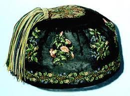
243. Maldon

They’ve tried to go bold here with a strong font choice and a stylised representation of a boat. All I can see, however, is one of those Victorian tasselled smoking caps. You know the ones:
242. North Somerset
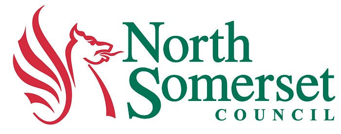
You remember that annoying snowclone that went around Twitter a few months ago: “Tell me something that isn’t X, but feels like X”? Tell me something that isn’t Welsh, but feels Welsh.
Only unlike some of the Welsh logos, they’ve used better fonts and fitted them properly.
241. Trafford
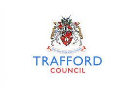
I approve of the boldness of the colours, otherwise this does nothing new.
240. Pendle
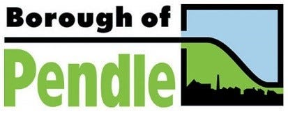
Pendle is notorious for having been a hotbed of BNP activity back in the day, and I believe was the last place to elect a BNP councillor. Anyway, that isn’t reflected in its logo, which is a chunky and almost cartoony arrangement let down by the squished text of the council name and the slightly odd border/line arrangement around the illustration.
239. East Renfrewshire

Green and blue with leaves? Let me grab something lest I vomit from the innovation.
238. Ribble Valley

Inoffensive on almost every level, and unremarkable as a result.
237. South Cambridgeshire

Local government by Pantone Swatch.
236. Ryedale
Ryedale is an utterly mad place politically, with the Continuing Liberal Party having a pretty strong local presence and no Labour councillors at all. Sadly their logo is not rainbow comic sans with a big LSD smiley face, but a rather boring simplified crest.
235. Mendip

Another dull swoosh elevated slightly by nice lettering and colour choice.
234. South Derbyshire
Why would you centre-justify your name like that, you total monsters?
233. South Kesteven
A very slight amount of quirkiness to the font here gives a basically poor piece of work extra marks.
232. Surrey Heath
The negative space as gradients thing can be done well, but you need to be very sure of yourself before trying it. In this case, there’s too many lines and it just gets messy.
231. Denbighshire
It was a Dark and Stormy Night. Suddenly, a palette limitation to blue and green rang out!
230. South Tyneside

Come on lads, give me some sort of challenge.
229. Scottish Borders

I think this is meant to imply either a Roman warrior keeping an eye on the Picts (Hadrian’s Wall is some way down inside Northumbria, which means probably not) or a local keeping an eye out for perfidious Albion crossing the border (more possible). It’s an okay representation with some oddly superfluous bits, and a line style that doesn’t match horse with rider.
228. Stratford upon Avon

Nice effort with the text on the circle, but the sans-serif text sits weirdly alongside it, is superfluous and is far too thin.
227. North West Leicestershire

The council area where I grew up! So I know this well from bin lorries. Strong Blaircore (with the common subtext of “the mines are gone, shit let’s fall back on trees” that accompanies many of these designs) but the tree device on the H is clever enough to elevate it above the pack. Too many words for a council area name really. I’d just call it Coalville District Council and Ashby can lump it.
226. Suffolk

The failure to curve the back corner on the extruded block here hurts me inside. It would have been so easy! And crucially it harms what is otherwise a standard mid-tier logo.
225. Vale of Glamorgan

This can’t seem to make its mind up between charmingly hand drawn (in which case, roughen the edges on the sky and find a different font) or geometric (in which case, square off the cliffs and the waves).
224. Tamworth
There’s a nice attempt at invoking a spirit of connectivity from this logo, but otherwise it’s very uninteresting.
223. Sutton

So nearly good, let down by the low-effort tree and the blueish and therefore clashing green. I’d have made the entire tree red for a nice monocolour look.
222. Tandridge

I suppose the “we have bushes” look is relevant for a random chunk of the Home Counties which I hadn’t heard of until a few minutes ago. The reversed out version they use on social media has District Council sitting among the clouds which is somehow more romantic.
221. Devon

A pleasant colour combination for a dentist’s surgery, with minty overtones. Sadly, not a hugely interesting choice.
220. Thanet

They’re squiggles, but done with a certain artistry, and I have to admire the boldness of doing “lefties on twitter” style affected lack of capitalisation in a local government logo set in serif font.
219. Wandsworth
I do enjoy a negative space skyline and this is no exception. It’s just a shame about the institutional blue and green rendering it so drab.
218. North Ayrshire

They’re trying to engender a feeling of dynamic action via the pointy arrows and swoosh, but that also leads us to the squashed word “council” at the bottom which really sticks out and rather spoils the effect.
217. Rhondda Cynon Taf

The loopy ribbon illustration on the dragon is aging out of fashion now, and I’d prefer a less dull red and green, but on the other hand, it reminds me of the Pokémon Dragonair, so I’m still in favour.
216. Warwick
I really see what they were going for here! The tower is in a cool monocolour style and the composition is strong. The choice of black as a colour rather than sticking with the royal purple is a baffling choice however, which undermines much of my goodwill.
215. West Devon
Ambition, people! What do they feed you in *checks notes* Tavistock? Porridge and cuddles? Get yourself a massive coffee and actually grind out some work for once.
214. Exeter

They’ve had the idea to do something nice and 3D modeled like Monmouthshire, but they’ve bottled it and left us with grey lumps in the rough shape of a castle. Underperforms its potential.
213. West Suffolk

Perhaps instead of developing his own app, Matt Hancock could have saved everyone taking the piss and paid a designer to make his local council a nicer logo. The blue-purple gradient is an improvement on the out of the box blue-green some others have adopted, but it’s let down by the out of place grey and is a weak copy font masquerading where a strong display font should be.
212. Windsor and Maidenhead

If the goal of graphic design is to communicate the essence of a brand visually, then mission accomplished for the “we’re posh” campaign of the Royal Borough of Windsor and Maidenhead, from the unadulterated flowery crest to the regal purple and gold colour scheme. It’s just a shame it comes across like a sign outside a spa resort.
211. Worcestershire

There’s something a bit jarringly out of place about lower-case text set against a crest — like seeing your headteacher coming out of a strip club. They’re two different registers of visual language and putting them side by side communicates nothing so much as amateurishness. One or the other could have been okay, but the combination raises more questions than it answers.
210. North East Lincolnshire
After so many coastal boat logos, I’m astonished NE Lincs (Grimsby) council has avoided doing the same. A fish would have been right there for the taking! So I’m actually quite appreciative of the very literal interpretation of the brief. It’s a shame they chose the rather blunt primary colour scheme and the oddly justified text, otherwise this could have been nice.
209. Aberdeenshire

Given the majestic Cairngorms, the presence of Balmoral, and some rather stunning coastline, it’s impressive that they managed to go with something bland that could be the logo of a minor insurance company or a regional airport. There’s nothing technically wrong with it, but it’s a missed opportunity.
208. South Oxfordshire

There’s a dreamy ethereality to the illustration here which is nice as a bit of art but doesn’t really suit a logo, as evidenced by the text not knowing what to do with itself.
207. Rochdale
If you’re going to do a crest and text, you could do worse than this tasteful implementation.
206. North Lanarkshire

Big fan of the font choice here — it’s loud but dignified, and set nicely in a way that suits the compass device. The colour scheme is a bit of a letdown and I’m unconvinced the gradient suits it — I’d have preferred a flat design — but overall, it’s not a bad showing.
205. Merthyr Tydfil

This does look like the sort of statue you’d find early on in a Bioshock-style art deco dystopia, but I think it’s meant to be hair. Either way, I appreciate the effort, if not the font choice.
204. Newport

Behold the Lion Boomerang, guardian of Newport. Cardiff’s little brother also feels it needs a mythical creature on its logo, and the curvy shape is attractive if still rather confusing.
203. Bristol
Another good deployment of circular text, and quite a nice device, let down by the poor interplay of red and grey.
202. Cornwall

Just a smidge too busy and the stroke on Cornwall isn’t doing it for me. Still, good colour combination.
201. East Ayrshire
It was strangely difficult to find a high quality copy of this logo, but when I did, I noticed that it strongly resembles a seventh-tier football team formed in about 1999. They’ve tried manfully to recreate the shield using the E and the A but both come out looking a bit malformed. East Ayrshire has even fewer Gaelic speakers than South Ayrshire at 0.3%, but they’ve incorporated it fairly well here, so points for inclusivity.
200. East Dunbartonshire

This one is perfectly competently done and I do like a negative space logo, but I can’t shake the feeling of the lack of ambition — and the sense of it being the logo of a budget PC manufacturer.
199. Orkney
From the smudging around the edge of the text and the crest I get the strong feeling this was drawn by hand and then scanned and digitised using Illustrator’s Image Trace tool — they’ve not done a bad job of it, and it gives the logo a charming authenticity which is lacking from some of the more corporate identities. I can’t shake that this is just a boring crest and text combo, though, despite the fun Viking-y tone of the imagery.
198. Perth and Kinross

Well this was more intense than I was expecting. If you’re going to do a crest, do it in style — this really helps communicate “put your bins out on the correct night or we’ll fuck you up”. Not such a fan of the blue on teal, but this could easily work nicely in another colour so it’s not a big deal.
197. Ynys Mon

The sun rays and waves contained in a circular crest make this look like the logo of a Central Asian Communist Party circa 1978. Still, one of the more tasteful uses of blue and green, if you absolutely must use it.
196. Neath Port Talbot
Not a bad little colour scheme — varied without becoming clashing. The line work is a bit more cartoony than I’d prefer, and could do with some sharper edges, but overall a pretty good effort that incorporates the Welsh version reasonably well.
195. Gwynedd

Not a bad go, and easily adapts to other formats, but the colours are a bit murky.
194. Gateshead
Gateshead shouldn’t exist as it’s functionally part of the Newcastle urban area, and I think they have acknowledged this themselves with this extremely Ronseal logo featuring, uh, a gate and a helmet. Ditch the superfluous swoosh and get a non-italic, bolder font and you might be onto something okay here.
193. King’s Lynn and West Norfolk
Adopted in 2009, this is about as basic and down the line as a council logo gets, although it is the rare “crest on the right” version of the old standard. There’s otherwise very little to say other than have you considered you aren’t a government department and so can have a bit of fun?
192. Antrim and Newtownabbey

An actually very lovely and subtle combining of the A and the N, it can’t help but indulge in toothpaste water, not for the first time in this list.
191. Newham
“We’ve got this bold new logo with a central hot pink stripe placing us in the viewer’s mind as an exciting place right at the heart of the nation’s great capital city.”
“Fantastic, what colour shall we make the text?”
“I was thinking grey.”
“Grey?”
“Yes, a really dull, uninspiring grey that doesn’t at all match the pink.”
“I love it.”
190. Portsmouth

Nice font, okay crest, but find and hound out of the country whoever ordered that hideous gradient placed over it.
189. Kirklees

It’s a tough task to design for Kirklees, which is largely composed of Huddersfield but also includes towns like Batley which don’t appreciate being lumped in with it. That probably explains the decision to go with an abstract unifying symbol rather than anything recognisable.
188. Camden
It took me many minutes of staring to work out this is meant to be people holding hands and forming a crossroads. It’s fine as these things go.
187. Colchester
Clearly modelled on Boudicca, who was not, as you might assume, from Colchester, but perpetrated an act of genocide there during the Iceni rebellion, when she and her troops systematically slaughtered every Roman in what was then the capital of Britannia. So it probably rubs salt in the wound to stick her face on a not very inspiring logo two millennia later.
186. Rotherham

It’s not bad. I’d have swapped the bolding from the subtitle to the main title for a clearer hierarchy, but you can’t go too far wrong with a decent negative space. Rotherham Council win points for being one of the few councils to make their brand assets including fonts available to download from their website. More councils should do this, as getting hold of some of these has been absolute murder.
185. Forest of Dean
Now I’ve been in the USA for a few weeks I’ve learned that this is what all their healthcare company logos look like, which has turned me off my initial positive impression. Lose the faux-3D and we might be talking.
184. Halton

I really like the faux-3D extruded effect on the H — although I am less keen on the wiggly river line.
183. South Northamptonshire

Another one lost in the reorganisation of that county this year, and no important graphic design was lost in the process.
182. Lancashire

I’m not sure what’s going on with the wordmark here. It looks like it was made of gelatine and then sucked on for half an hour. It’s not an awful look, but jars badly with the very angular rose and supporting text.
181. West Sussex
Well it’s a crest with some text, but as crests go it’s reasonably artful and doesn’t resemble Cthulhu ensnaring a knight, so it’s not bad for the genre.
180. Ashfield

Ashfield is dominated locally by a mad franchise party called the Ashfield Independents, led by an ex-Lib Dem, who disappointingly don’t seem to advocate sovereignty for North Nottinghamshire.
Their council logo wouldn’t inspire many to rally round the flag anyway, given that it is the most bone-breakingly literal interpretation of the name possible.
179. Cumbria

The intention here is clear, although it manages to accidentally take on the look of those bilingual Welsh councils. The negative space needs to be at a different angle to make it more legible.
178. Barnsley
It’s not by any stretch anything special, but I am a fan of the extra-chunky font.
177. Basingstoke and Deane
A nice blue is the main standout of an otherwise pleasant enough but unremarkable logo.
176. Bexley
This is the kind of curiously specific motto that makes me wonder why it was necessary. There’s an implied and unspoken “…again, after the incident” which doesn’t exactly endear me to this corner of South East London. Still, always a fan of a slab serif.
175. Blackpool

This is actually quite nice and a good combination of colours with a hint of contrast. The tower of people is a nice bit of illustration which the council seems frustratingly reticent to use, losing it some points on no fault of the designer’s. The stripes are a bit 2003 as well, hence why this strong concept doesn’t rank higher.
174. Brentwood

We here at My Brain like an extruded black shadow, so this adds some much-needed depth to the standard look. A stronger font choice which leaned into the vaguely comic book air would have earned it more points.
173. Cambridge

Well it’s got the Cam and it’s got a bridge over it, what more do you people want? A coherent colour scheme and some higher quality illustrations? You don’t know you’re born.
172. Eastbourne

Nice lettering rescues this, which otherwise appears to have been salvaged from a low-res PNG using Image Trace. The seagull slotting into the gap in the clouds is pleasing as well.
171. Derby

I grew up a few miles from Derby, had regular shopping trips there, and used to change trains regularly there between 2012 and 2015, and yet I took until the age of about 24 to work out that this is not a strange angular snail, but a ram standing in front of a deer. Once you see it, it’s nice — but I wonder how many person-hours have been spent wondering about the significance of the snail.
170. Ealing
A perfectly competent drawing of a tree spoiled slightly by the presence of that bloody great black bar.
169. East Lindsey

One of the stronger examples of the sea/coast/land motif, with a good colour selection, although deployed in the wrong order, perhaps. Unless those are supposed to be rapeseed fields in which case plough right ahead.
168. Eden

This is the inner bit of Cumbria, apparently. In any case, it’s like a boring serif logo got taken over by one of those brain parasites that makes ants expose themselves to predators so the parasite can reproduce.
167. West Lindsey

If I had no remarkable features other than a lot of farmland, I’d probably emphasise that too.
166. Greenwich
I’m a fan of the mix of sans and serif fonts here, which are classy and well kerned. The swoosh seems superfluous, however, and they could have condensed the logo by placing the rose inside the O.
165. Guildford

Not a bad effort — understated, politically neutral and with a strong central mark. Good work.
164. Mole Valley

Not the only logo to lean back on folds of hills, it’s disappointing they didn’t go the full Broxbourne and indulge in some subterranean mammals.
163. Arun
The matching of the seagull’s wings with the waves gives this a nice symmetry lesser designs wouldn’t have bothered with. Shame it’s using Lato, with its horrible inner curves on the letters (note the feet of the A).
162. Shetland
Shetland council don’t appear to actually have a fixed logo, as I’ve found several variations in use. The central crest is… interesting, with the horse and unicorn blowing raspberries. The Viking seafaring heritage is on full display, but it’s just too complicated to rank much higher.
161. Great Yarmouth

Nicely wide-tracked supporting line makes up for an otherwise uninspired concept.
160. Hambleton
It sure is a logo for Hambleton District Council. Undeniably so. Might go drink a glass of tap water to heighten my excitement even further.
159. Harrow

Purple and orange are a Blaircore classic and Harrow is no exception. Hooking the fonts together is a nice touch but I think they’re just too different to one another for it to work well. A rounder sans serif or a less flowery handwriting font would work — as it is, one of them should go.
158. Hertsmere

I wonder if Hillary Clinton’s people knew someone from Borehamwood? A boring font lets down what is otherwise a cool mark.
157. Ards and North Down

The epitome of an inoffensive NI council logo.
156. Midlothian

Lifted from an Apple print ad from about 1995. Long live the green gradient of mediocrity.
155. Kensington and Chelsea

Kensington and Chelsea has its pockets of poverty but it’s been in Conservative control so long that its image of poshness is ingrained, and the logo, like Windsor and Maidenhead’s, communicates this. The main difference here is that it chooses a more understated colour scheme.
154. Hull

The three crowns is a nice device that doesn’t go the full crest, but it’s safe to say this logo doesn’t really make the most of it. The fonts are anemic and ill-suited to the imagery, and the layout is basically a simplified crest design.
153. Kingston-Upon-Thames
I’m left wondering if there’s one designer doing all the posh council logos, because this one appears to be using exactly the same font as Kensington and Chelsea, just with an even richer deep blue.
152. Malvern Hills

You can definitely see the intent here, and if they’d gone with a more “fun” font and leaned into the design they might have pulled it off. As it is, it’s some dull system text illustrating an alien arm stealing our lakes.
151. Barrow-in-Furness
A solid illustation, although perhaps a missed opportunity to hint at the town’s shipbuilding heritage and, indeed, present.
150. Manchester
As with many industrial cities I understand why they feel the need to include the crest, but I wouldn’t say it tries very hard to innovate. I rather like the font, especially the little twist on the leg of the R, but I would prefer it to be bolder.
149. Melton
The neutral dull green and irritating present tense handwriting slogans are back, but who are we to argue with the Eye of Sauron?
148. Pembrokeshire

I’m not saying it’s good for a council to have Wicker Man Energy but if it was, this would win the prize.
147. Newark and Sherwood
If any council is probably justified in using a tree in its logo, it’s probably this one — and I’m rather a fan of their use of negative space. Just a shame about the font (which looks like Neo Tech but probably isn’t, judging by the ampersand) which sadly doesn’t fit where a nice subtle serif or slab serif would have done.
146. Norfolk

The hierarchy on the text is nice, I appreciate the more yellowy green, and the crest simplification is a good start, although I’d have gone further and removed the top part altogether. Unremarkable but basically solid.
145. North Tyneside

If you’re going to crest and text it, a relatively nicely outlined primary colour crest with a strong through line, in this case the nautical theme, is probably the way to go. Lose or change the font on “We Serve”, though.
144. North Warwickshire

Similar to North Tyneside, a strong colour scheme and nice detailing save what is otherwise a quite generic logo from being cast aside. I like the subtle reflectiveness.
143. Conwy
Having your place name spelled the same in English and Welsh is very helpful for logo design, it turns out. Not doing anything particularly fresh, but it works.
142. Oxford

That’s definitely an ox, and there he is fording a river (presumably the Cherwell). I would dial down the capitalisation on the font, but I appreciate the working of the ox device into a negative space rectangle.
141. Maidstone

This is almost really good, if they hadn’t had to overly warp the river to make it into a recognisable S shape. The illustrations are good, though.
140. Reading
I quite like how this could either be a triangular jigsaw or some sort of Nordic rune, and I don’t care to check which it is. Not innovative, but the main device is arresting enough to be
139. Solihull

I find it quite funny how everything about Solihull is geared around insisting it’s not part of Birmingham, right down to the motto which translates to “town in the country”. Anyway, this suburb of Birmingham has a charmingly eighties logo which has staying power thanks to its undeniably good hierarchy and nice chunky slab serif. I just wish they’d embrace urban life.
138. Gedling

If you’re going to have a crest, say it like you mean it — Gedling certainly does with this impactful slab serif. Less maudlin colours, though, please.
137. Staffordshire

The concept here is very nice, and relatively competently executed. It’s just that, once you see some bum cheeks wearing a thong, you can’t unsee it.
136. Stroud
A solid effort from the lads at Ebley Mill here, the council building depicted in this rather nice line drawing and masked with the hills that make up the local landscape. The font (Museo Slab or Rockwell, to my slab serif-liking eye) is well chosen and matches modernity and professionalism well. I’m not wild about the attempt at making an S with the right-hand hill — which isn’t obvious enough to justify the cutting out of significant parts of the illustration.
135. Sunderland

Another staple of Blaircore was the shiny bokeh device, used here to communicate a sense of shiny newness without having to refer to any particular local landmark or bit of heritage. It’s a good example of itself, but let’s not pretend it breaks many boundaries.
134. Swale

This is the kind of logo a TV show might create for a budget airline so it can avoid infringing copyright, but each element is nicely deployed, and orange is underused as a highlight colour in these council logos despite its high visual impact and lack of partisan connotations (shut up Lib Dems, you’re yellow and you know it).
133. Thurrock
Chunky font and chunky leaves are a good combination, and although it won’t be winning any prizes for originality, it’s a competent idea competently deployed.
132. Tower Hamlets

This could be a solid logo (and font-wise, I adore Futura) but for the irritating tapering on both the castle stroke and the river lines. It feels very rushed, and from the slightly lumpy vector lines on the water it’s clear this was just hand drawn and run through the Image Trace function in Illustrator.
131. Wyre

I maintain it would be very funny if this corner of North Lancashire just ripped off the Wired Magazine logo (let’s be honest nobody has read it in years anyway) but this isn’t a bad stab at a wordmark with some nice satisfying kerning between the letters. It’s also pleasing to see they don’t feel the lack of confidence that drives so many councils towards ALL CAPS.
130. Warwickshire

The restriction of the bear illustration to 45 degree angles is an interesting choice — it almost works very well, but there’s too many angles in an attempt to add definition, which just ends up making it quite lumpy.
129. Dumfries and Galloway

Dumfries and Galloway is a very odd council area geographically, consisting of one large town housing around a third of the population, and then a long tail of tiny villages stretching out to Stranraer and the ferry port to Belfast. As a result it’s easy to see why they couldn’t find a unifying bit of visual imagery and had to fall back on a vaguely celtic-feeling wordmark. It’s not badly done though, with some nice negative space. It would work well on a vinyl sticker.
128. Swansea

There’s a certain bold swagger to calling yourself “City and County of X” which I tend to associate with American cities, because San Francisco, Honolulu and Denver all do it. Swansea probably does not rank among those cities, although one of the earlier interactions I had in Seattle was with a barber who had unaccountably spent a lot of time in Swansea. The swan is a bit shoddily drawn, but look at him. He’s massive, he’s red, he really fucking loves Swansea.
127. Wrexham
It will doubtless pain Wrexhamians (Wrexhamites?) that I have placed them below Chester, but they can take some pride in their excellent vampire fangs. I wonder if Welsh has an equivalent of the Academie Francaise, because if they could be convinced to introduce an X to the language, it would make everyone’s lives a lot easier.
126. Northampton

I’m a big fan of this geometric crest, and it’s just a shame the fonts don’t work for it at all. If every a design called for a slab serif, it was this one.
125. Kent

The Kent Horse must be a nightmare for designers to work with — so iconic it can’t be left out or adulterated, but an absurd shape that won’t work with any hierarchy. Still, this is an improvement on the old logo, which used Neo Sans, a font I associate exclusively with the Brown and Miliband eras of the Labour Party. The slightly organic curves of the new font are quite pleasant, and the successful working together of the Y in County and the I in Council makes me doff my internet cap.
124. North East Derbyshire

This might be the only time in this list you see me praise the introduction of Crest and Text, since it replaces a truly painful mashing together of various initials into a blob that did nothing.
123. Oxfordshire

As such an old county it’s wise to be careful about the potential dilution of the heritage when designing this one, and a subtle circle device is probably the best way to bring the crest into the modern era. It’s still too complicated, though.
122. St Albans

A strong starting point with this device, and I like the shadow behind the yellow cross, although I would lose the inner shadow which draws the eye away from its focal point. The font is disappointingly dull, one of the examples where a striking serif would hit home just right.
121. Wolverhampton

Some very strong wordmark work here, and although the council does officially have a crest it seems to be moving away from it, so I’ll give them the benefit of the doubt. The kerning work on display here is interesting, seeming at first wrong but later starting to work, with the pseudo-ligatures between the R and H and P and T nicely cutting down on wasted space.
120. Carlisle
My long suffering social graphics clients will know I love cut outs overlaid over text, and the chunky serif here suits it well. Highlighting Carlisle’s main pleasant feature, its castle, is also well chosen. They’ve fallen down mainly by overdoing the detail — sticking to black and white without the hills and fewer battlements would have been more effective and memorable.
119. New Forest

I thought we were about to see our first Squircle in a logo but alas it’s just a heavily rounded off square. Situating the boat within the antlers is a strong touch, and absent a serif for “district council” it’s just shy of very nice.
118. Aberdeen
A nice quirky crest and good main font choice which matches the stroke colour. The supporting font does seem like an afterthought, however.
117. Cheshire West and Chester

It does unfortunately resemble the Britain First logo, but that’s hardly their fault. A quality mark and nice font choice, let down by the faux-depth use of the gradients, which feel a bit cheap and limit its range of deployment as a single colour logo.
116. Dartford

I will applaud anyone who joins me on board the Futura train, a modernist express locomotive heading towards a bright shining art deco future. Probably could use some sort of visual, but that’s a relative nit pick.
115. Ipswich

I was excited when I first Googled this as there’s an Ipswich City Council in Australia with quite a nice logo, and this isn’t it. But for a crest and text, it’s been done well. Simplified down to a single colour, weighty font choice, nice local touch in the elements.
114. Islington
Unpretentious, straightforward, and unlike some London borough logos, dignified. A quality bit of work.
113. Norwich

Nicely condensed version of the crest meets a strong 1930s-style sans serif font, which I can’t quite identify. It’s a bit like Century Gothic, maybe. If anyone can get it, tell me or it’ll continue to bug me.
112. Lambeth
Veering towards Blaircore with the incomprehensible shapes positioned to the top-right, but the rather excellent font work here (which I think might be custom, or at least heavily modified) pulls it back. I’m a sucker for a slight elevation on the spine of an L.
111. Middlesbrough

A nice combination of the slogan with a device combining arrows with the famous Tees Transporter Bridge. I’m not sure I would use a slogan that implies a past unpleasantness that needs to be moved past (no matter how true that might be) and if the arrows aren’t immediately gleaned, it could look like a town for Smurfs. Still, not a bad effort.
110. Angus

With apologies to Angus for leaving them out of the first draft of this article, they have a nice gradient which softens my dislike of the blue and green that’s so common in this list. It’s a shame the attempt to say “we have mountains and sea” in the main mark comes across more as a collapsing tent.
109. Birmingham

I’m sure you do ❤ Birmingham, but it’s sort of lost on me as a visual device, and the line needs to go. It comes across as a logo of a city trying to boost its confidence, and to be fair if I’d been supplanted by Manchester as a city I’d need that too.
108. Wigan

Wigan joins Birmingham in the heart club, and here it’s a bit more understated and cute. Combined with the generic colour combo it comes across like a mid-range gym chain.
107. Redbridge

This works far better in single colour vector form than the multicoloured version with the photo of the leaf. Missed opportunity to have a bridge device, although points for taking the road less travelled. At least it’s a nice bold red.
106. Rugby
Fair play. While the Rugby ball is an obvious one, Rugby the town is also a place of enough history that I’d thought they might shy away from it, but this is a nice bit of vector work with the wordmark forming the subtle posts, too.
105. Salford

I adore the bold hot pink and the font is nicely chosen (it looks like it might be some variant of Roboto), both of which combine to make me think this was designed for web use, which is sensible since that’s how most people interact with council services. Doesn’t quite justify the existence of a council area which should by rights have been absorbed into Manchester years ago.
104. Stafford
THIS is how you simplify a crest. Bolden up that font, though, lads.
103. Walsall

The lions and bear are rather cute, and there’s been some love put into the redrawing of this crest. Reminds me of a notoriously scary Teletubbies episode, though.
102. Fermanagh and Omagh

Not really a true crest as it does seem to be a new design, just aping a crest in its construction. It’s fine.
101. Waverley

Unlike many designers, I don’t actually dislike handwriting fonts, I just don’t like the ones that don’t look like handwriting and are deployed inappropriately. This is a good example of it done well (and might in fact be real scanned handwriting). Doesn’t combine well with a serif supporting font, though — they compete too much for attention.
100. Worcester

If you must use crests, I actually quite like them clinking together like two pint glasses.
99. Caerphilly
If you have a lot of text, as these bilingual logos must, you could do a lot worse — includes but doesn’t overplay the castle, and comes across as a logo for some kind of exciting rally tournament, not an experienced matched by actually visiting Caerphilly.
98. Armagh City, Banbridge and Craigavon

For obvious reasons there are a lot of colours and devices that designers of Northern Irish local authority logos have to avoid, and that’s something this logo manages reasonably well. It’s a shame the colours aren’t more vibrant though, even if that would push dangerously close to orange and green — I feel like I’m looking at it in the dark.
97. Derry City and Strabane

It’s a D, an S and a river device, combined rather nicely. I was a bit surprised they call it Derry and not Londonderry even in the Ulster Scots translation, although I wouldn’t be shocked if that’s a local point of contention.
96. West Oxfordshire

Home of David Cameron and also an incongruous number of Labour and Co-op councillors, the illustration here recalls a framed photo on a mantelpiece, apt for a picturesque bit of the world. Unfortunately the lack of a gap between it and the council name makes me itch — they should probably be side by side.
95. East Hertfordshire

If only they’d even up those line thicknesses, this would be really strong. Any council logo you could quite plausibly put on a neon sign is alright with me.
94. Sheffield
Ah, the old home town. I wish they hadn’t gone with the blue-green standard but I rather like the busy illustration incorporating quite a few local landmarks — it’s the sort of thing you might see on a book cover, although it’s perhaps a bit too busy for logo use.
93. Lincolnshire

ALL HAIL THE DANCING DEMON OF STRATEGIC PLANNING, WASTE DISPOSAL AND LIBRARIES.
92. Mansfield
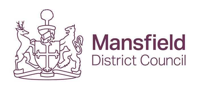
A strong simplification from an older, very busy crest-based design serves this well. Bonus points for matching the supporting font thickness to the line width.
91. Adur & Worthing

This is one of the flagship areas for the Blue Wall theory of deteriorating Conservative support in previously solid areas of the South, driven by the young and educated aging or being priced out of London. As such, it’s perhaps appropriate that it resembles the logo for a premium audio brand like Bang and Olufsen. I like it. But then I would.
90. Brighton and Hove
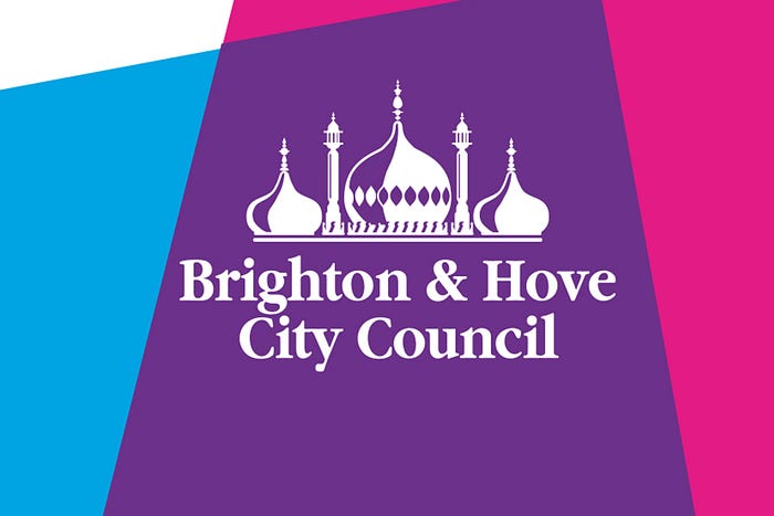
The Pavilion is an obvious choice for a unifying image (the Pier would work but lots of towns and cities have a pier) and happily it’s well rendered. The coloured backdrop device isn’t strictly part of the logo but I’ve included it as it does work nicely as part of the design system and seems very flexible in its potential deployment.
89. Central Bedfordshire

As council design language goes, “We aren’t going to fuck you about” does have some appeal. The subtly grey secondary colour on Bedfordshire works much better for a green backdrop than a hard black would have.
88. Oldham
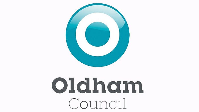
A gradient fill is best avoided with logo work as it limits your range of use cases, particularly against busy backgrounds or when no colour can be used. Also I think they’ve tried to subtly thicken the “O” in “Council” as a nod to the motif, as they have with the one in “Oldham”, but it looks like an error. The overall look is striking at a glance, however.
87. Gosport

A hand drawn illustration can be a nice thing when used sparingly. There’s elements of Ligne Claire flat shading to it which I rather enjoy and make it suitable for logo use.
86. Hampshire

Good work for a basic concept — nodding at the county’s heritage without overdoing it.
85. Horsham
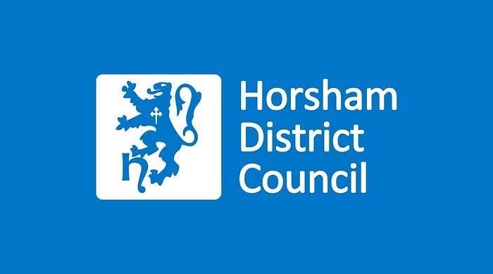
So very nearly excellent — a more squared off sans-serif or a subtly chunky serif would have nailed it. Pretty good anyway.
84. Southwark
Another pretty good handwriting example. I think this sums up how to do it — use it as a flourish or highlight, which looks authoritative, and not as a supporting element, which looks childlike.
83. Swindon

Good work on this one — subtle enough to not make me cringe, obvious enough to stand on its own.
82. Torbay

This one was apparently described as “Stalinist” by a former mayor, which makes me like it more, if it annoys bores like that. It announces itself strongly and doesn’t overstay its welcome, and the stripe of yellow nodding to the seaside is a good touch.
81. Broxbourne
The Badger of Broxbourne wants you to take it up with him if you’ve got a problem with the place, mate.
80. Inverclyde
Nice and understated.
79. Ceredigion

The crest here I’d be tempted to describe as overly complex, but whoever converted it to a vector did a very good job, which makes it a lot more easy on the eye and suited for digital use. One of the better examples.
78. North Lincolnshire

Should really be called Scunthorpe, but nonetheless, a strong effort which avoids using the steelworks or the seaside, therefore heading off inter-town conflict. The colour choices are strong and the fonts integrate nicely.
77. Cheshire East

You need to be very careful with the wheat sheaf given its communist past, but this one pulls it off reasonably well, with some great line work.
76. Crawley
I applaud Crawley for trying to do something different with the tree concept, and that can help me overlook the fact that’s really too many colours for a logo.
75. Dover

Splitting the castle from the sea using negative space white cliffs is very nice as an idea, but it takes a second and the font doesn’t quite meet the required boldness.
74. Fylde

The negative space windmill is a clever use of the concept but does rule this out from use against non-white backgrounds where the negative space won’t develop.
73. Harborough
The narrowboat frames the church very nicely, and it’s the sort of design that would look good on a road sign, albeit perhaps too complex for small print work.
72. Leicester

The rose is a key link to Leicester history. You might, as I did, imagine it’s the white Yorkist rose, a connection to Richard III, who met his end nearby and was famously buried in what became a local car park. It’s actually the cinquefoil device of the Earls of Beaumont, local landowners under the Normans. Anyway, it’s nicely simplified here, and if you visit the city you’ll find it very visible.
71. Northamptonshire

Despite being next door and also using a rose for its logo, Northamptonshire’s rose is entirely different from Leicester’s cinquefoil, and is a deliberate merging of the Yorkist and Lancastrian roses. It’s quite well used here, combining well with the slightly rounded fonts.
70. Nottinghamshire

The large slab N and the fancier leaf device gives a nod to the county’s age (and consequently large oaks) and the Robin Hood/Sherwood Forest legacy, while also hinting at sharp edged modernity. A nice contrast.
69. Preston

Probably the most overtly religious logo in the mix here, impressive considering there’s at least two places named after saints. One suspects the city’s name might be a modernisation of Priest Town, and in common with much of the North West, the city does have a fairly impressive Catholic cathedral. In any case, it’s nicely drawn with a good colour contrast.
68. South Staffordshire
The sunburst is an underused device in the ranks of council logos, and it’s nice to see at least one.
67. Chichester

It’s a bit Wimbledon with its green and purple colour combo, but the line drawing is nice and it’s a rare example of circular text fitting in nicely.
66. Stockport
The “Crest, but make it tasteful” approach shows up everywhere, but seems particularly prevalent in the North.
65. Watford

They’ve clearly taken their city’s motto literally, as those are some chunky lines and chunkier text. It’s a nice reworking of the crest, albeit rare to see a fasces in British political design, for obvious reasons!
64. Lisburn and Castlereagh

A nice subtle gradient deployment, it kind of resembles waves, which would work better if Lisburn was anywhere near the sea.
63. East Lothian

Another one I missed out of the initial list, and a shame because it’s nicely drawn and I approve of the authoritative typeface. The bird being drawn from this angle suggests an unhealthily authoritarian level of vigilance, perhaps.
62. Torridge

A lovely hierarchy here, built on the Torridge viaduct and with strong supporting text.
61. North Kesteven

I’m not quite sure what it is, but it’s a pleasing colour combination.
60. Southend-on-Sea
After many years of campaigning by its now-deceased MP, Southend will finally become a city soon. I hope they don’t throw the logo baby out with the bathwater, because the typography is nice and despite the blue/yellow squiggle so beloved of seaside towns, I have seen worse.
59. Barking and Dagenham
Someone’s seen those Beatles shirts. They need to sell a version with “& Chadwell Heath & Becontree.” to help fund their social care.
58. Newcastle-Under-Lyme

A pleasant little illustration with a nice colour choice and use of font. I would dial back the green to a similar level of pastel-ness to the blue, to score even more highly.
57. Bournemouth, Christchurch and Poole
A new council, this, and the dots do an adequate job at communicating the new operational area for residents, although it pushes at the boundaries of too busy.
56. Huntingdonshire
A nice subversion of the classic council swoosh with an understated geographic nod. The font is dignified, too.
55. Fife
The image of bringing people together via their bridges might be slightly hackneyed but the logo goes about it with such joy that it’s hard not to love it. The serifed lettering oozes character too.
54. Nottingham
Very rarely have we seen text backed with coloured blocks, which is strange as that’s very common elsewhere in graphic design. It’s arresting enough to make me overlook the mediocre crest work.
53. Cheltenham
Very very dignified, as you’d expect from such a regency city. It’s just a crest and text, but its minimal colours stop it from approaching garishness.
52. Dacorum
As in “You ruined my night completely so you could have the money and I hope now you can spend it on lessons in grace and — ” except spelled differently. Another example of a crest I don’t mind simply because it’s clearly been done so painstakingly in a way that’s appropriate for digital use.
51. Essex
The three scimitars of Essex are a classic bit of design and you couldn’t very well get away with not having them, so it’s probably for the best Essex has kept its logo simple.
50. Knowsley

Knowsley Council might not have meant the imagery of itself as a wedge jabbing into Liverpool deliberately, but if it’s an accident it’s a very apt one, and reflected in their simple but relatively elegant design.
49. Coventry

Coventry will be dining out on Lady Godiva (ooer) for long after I leave this mortal plane, so it would be futile to try and convince them to stop — if they are going to do so, the anaemic worm hair will be need to go, although otherwise the silhouetted horse works rather well.
48. Causeway Coast and Glens

The Giant’s Causeway, much as it presents many trip hazards to visitors, also presents many pitfalls where designers can badly overcomplicate — full credit due for failing to fall into them.
47. Leicestershire

This noble fox has ambitions for his county, and perched atop his cliff he’s ready to let you know it. Adopted in 2000, this logo is rather ahead of its time and has evident staying power.
46. Liverpool

The famous Liver Bird couldn’t not make an appearance up near the top of this list, so iconic a symbol of the city is it. Combines with a subdued but dignified purple in a way that will agitate neither football team’s fans.
45. Northumberland

The Northumberland flag is a strong visual image, and they’re correct to go with it rather than a crest. Left-justified text with the flag positioned above it, a bit like Canada’s official wordmark, might work well.
44. Plymouth
Looks to be inspired by the Keep Calm and Carry On posters, although that could just be the colours and the font. I like the simplicity of the crest-inspired icon.
43. Scarborough
I shouldn’t love it, but I do. It makes me want to go and see a vaporwave show with goths by the seaside. So mission accomplished, I suppose.
42. Mid Ulster
This otherwise nice logo uses the same font as the old New Statesman brand identity, which is fairly distracting. I was quite surprised there’s a Northern Irish council logo that can get away with using the Red Hand of Ulster and more so that it has a nationalist majority. Of course it isn’t inherently a sectarian symbol, merely representing the province without reference to its national or religious status, but if you have to Google it, maybe you’re losing that fight.
41. Chesterfield

A nice interpretation of the famous twisted spire, which might have ended up overcomplicated but instead feels optimistic.
40. Derbyshire

Points here for avoiding the temptation to centre the full block of text and instead lining the name up with the Big D (yes, yes, laugh away). That gives it a solidity and also allows you to detach “County Council” for some uses (though I’m not sure if they ever do this).
39. Sedgemoor

Not, apparently, the home of the skipping rope, although there’s a gleeful neon colour palette at work here which suggests a kind of cyberpunk wonderland that this place probably isn’t.
38. Woking

If you’re going to use a crest, fully lean into the medieval aesthetic with a bookmark ribbon surround. I’ve made good use of these before and it helps wrap the stark red-white-black colour scheme in an air of olde worlde heritage.
37. Glasgow

Their SNP council might be trash (literally, in the case of their bins) but their logo is a pretty good one, an interesting combination of geometry, colours and crest which ought to be overcomplicated but somehow isn’t.
36. Newry, Mourne and Down

There’s a delightful Dungeons and Dragons feel to this which I would like to see in more council logos, and the slab serif (Rockwell, maybe?) suits the playful but serious tone.
35. Leeds
It’s unusual that a crest containing a dead sheep would make it this high up the rankings, but it’s part of a very striking image with good colour contrast which ties itself together with the text quite well. Long live the three royal owls.
34. South Somerset

A classic of the forward-looking landscape constructed from geometric shapes stable.
33. Southampton

This teeters on the edge of overcomplicated but pulls itself back just before the tower block would overbalance it and is overall quite enjoyable.. The windows on the gateway making it look like a shocked face help it.
32. North Norfolk

A very nice drawing in of the eye via this simple but effective illustration. The people of Holt and Cromer and North Walsham have very pretty bins.
31. Wyre Forest

I think this is meant to be a tree rather than a shamrock, but that’s okay — it’s got an Op Art whimsy to it which I appreciate.
30. Cardiff

Cardiff’s furious dragon rising from the sea is the sort of thing you need an impressive castle to guard against — happily they’re well supplied. It’s a strong rendering that doesn’t overdo the text by adding “City Council”.
29. Barnet

Not known for particular effectiveness as an actual council, Barnet do have quite a nice logo albeit one clearly ripped from the BBC. Cleverly avoided kerning issues by shrinking the E and T tiles but keeping the spacing between the letter and the box edge consistent, making it less obvious at a glance.
28. Bolton

A solid slab serif wordmark on its own, it’s enhanced by its use in masking the colourful patchwork emphasising the city’s variety and diversity.
27. Canterbury

The Cathedral is the obvious choice, and the temptation to overcomplicate has clearly been avoided. A somewhat regal purple is the main remaining nod to the city’s age and heritage.
26. East Hampshire

I’m a sucker for a well-integrated descender, as I say on my OKCupid profile, so it’s nice to see slab serifs slot together as neatly as they do here.
25. Hackney
Although the H device doesn’t seem to signify a whole lot (bridges across Regent’s Canal, maybe? It’s hardly the Thames, which Hackney doesn’t border) the lettering is nice and it’s very bold and memorable. I get the impression of a place on the up, which is presumably what they were aiming for.
24. Lewisham
The crown constructed from joyous residents, their services adequately delivered, is a rather touching motif, and I’m glad they’ve kicked the old gradient in the head in favour of a flat design.
23. Surrey

A nice Yin/Yang formed from oak leaves makes the use of leaves into a positive through its creativity, and communicates the stolid conservatism of Surrey rather well.
22. Comhairle nan Eilean Siar/Western Isles
The most northwestern bits of our archipelago don’t have the easiest name to spell for English speakers, but their chunky lettering makes it a pleasure to read, at least. The ship illustration is pleasing too, if mainly because of its slightly alien proportions.
21. Powys
I have thoughts on the layout of this logo — namely, I’d like to see the wordmark overlaid on the bird with some kind of colour blending applied — but both elements are nicely drawn and recognisable at a distance.
20. Herefordshire
Helvetica is a design classic for a reason, and the minimalistic rendering of the apple gets away from the tree cliché on display elsewhere in this list.
19. Haringey

Controversial on its introduction, mocked as childlike and for its cost (the rebrand ran to a total of £86,000) the Haringey logo nonetheless offers a lot of flexibility and is a marked improvement on the old lightning bolt design.
18. Somerset
The combination of compressed fonts with perfect circles is best avoided in my experience, but that aside, this mixes complexity with instant recognition rather effectively.
17. City of London

The City of London Corporation, not surprisingly given its status as a financial center with few permanent residents, clearly has the money to throw at nice branding. This is a pleasingly modern take on a heritage crest.
16. Edinburgh

For a country with so many Roman and Viking-era settlements it’s remarkable more councils don’t use the V as a U, but it’s effective in Edinburgh’s case, and avoids the obvious route of using one of the city’s many landmarks.
15. Monmouthshire

A good use of one-colour 3D rendering, and avoids overdoing it on the castle detailing. A good effort, and there’s a laid back self-confidence in lower-case serif which communicates reliability.
14. Stirling
Stirling Council have just had this rather nice redesign, replete with Saltire nods and an inclusive colour scheme along with a classy font choice. The Daily Record grumbled that it cost £150,000 but hey, they’ve got a lot of assets and good design costs money and the old one really was crap. More of this, please.
13. Brent

Unpleasantly reminiscent of a roundabout for those of us with specifically traumatic memories of the Megabus to London, but a nice use of gradients excuses it.
12. Mid and East Antrim
Bonus points for working within the tough constraints of Northern Ireland — this is a really pleasing bit of vector work which combined great colour choices with a unifying visual image that also integrates (subtly) the initials of the council area. Well done.
11. Chelmsford

Four is perhaps slightly too many colours, but the combination of them works well enough that it’s not a major problem, and communicates a well-rounded place with many strings to its bow quite effectively.
10. Darlington

There’s a soft simplicity to this design which sticks in your mind, and I’m a sucker for a simply geometric representation.
9. Bromley

A really excellent use of arcs to provide a sense of dynamism, and the handwriting is again deployed in its best form. “The London Borough” was clearly added with the designer under duress, given its thin ‘please don’t notice me’ appearance, but it doesn’t ruin a very good logo.
8. East Suffolk

This council is very new, as is its logo, which does it no harm, but it’s still a remarkably nice approach. the combination of rural farmland and beautiful seaside is communicated well alongside the idea of forward progress.
7. Dorset

The colour choices push this one up from good to great, and not overdoing the D mask with a stroke or similar is well executed.
6. Craven
This is a lovely logo for a gorgeous part of England. Any local government area which manages to remind me of TinTin is doing something right.
5. West Lothian

A bold and adventurous use of colour brings complexity to a great vector illustration that calls to mind those classic railway travel posters I love so much.
4. Wirral
Wirral’s logo tells you that it isn’t going to stand for anyone telling you it’s Liverpool’s shit cousin. That’s some extremely bold font work. First municipal park in the world at Birkenhead, you know. And, from my experience at a friend’s wedding this October, some stunning rural bits too. Look upon Wirral’s logo, ye mighty, and despair.
3. Renfrewshire
Containing the town of Paisley makes the use of its signature pattern a clear choice, and they’ve deployed it wonderfully — there’s a lot of complexity and depth in some simple shapes and three bold colours.
2. York

I never thought I’d describe a council logo as rakish, but it’s the only word for it. York is going to swing in through the window, grab the heroine, duel three of your henchmen then ride off into the night as his fellows slap their thighs in victory. The dark Estate Blue coloration is the icing on a delicious cake.
1. Bedford
Ask me for a council logo that can reproduce at scale across your bin lorries and also strike fear into your enemies carried aloft on a banner into battle, and I’ll show you Bedford. A very strong use of pretty much every element here, this tells you the mighty Bedford is not going to let your bins go uncollected or your planning application go unprocessed — you have it on the Chief Executive’s honour.
